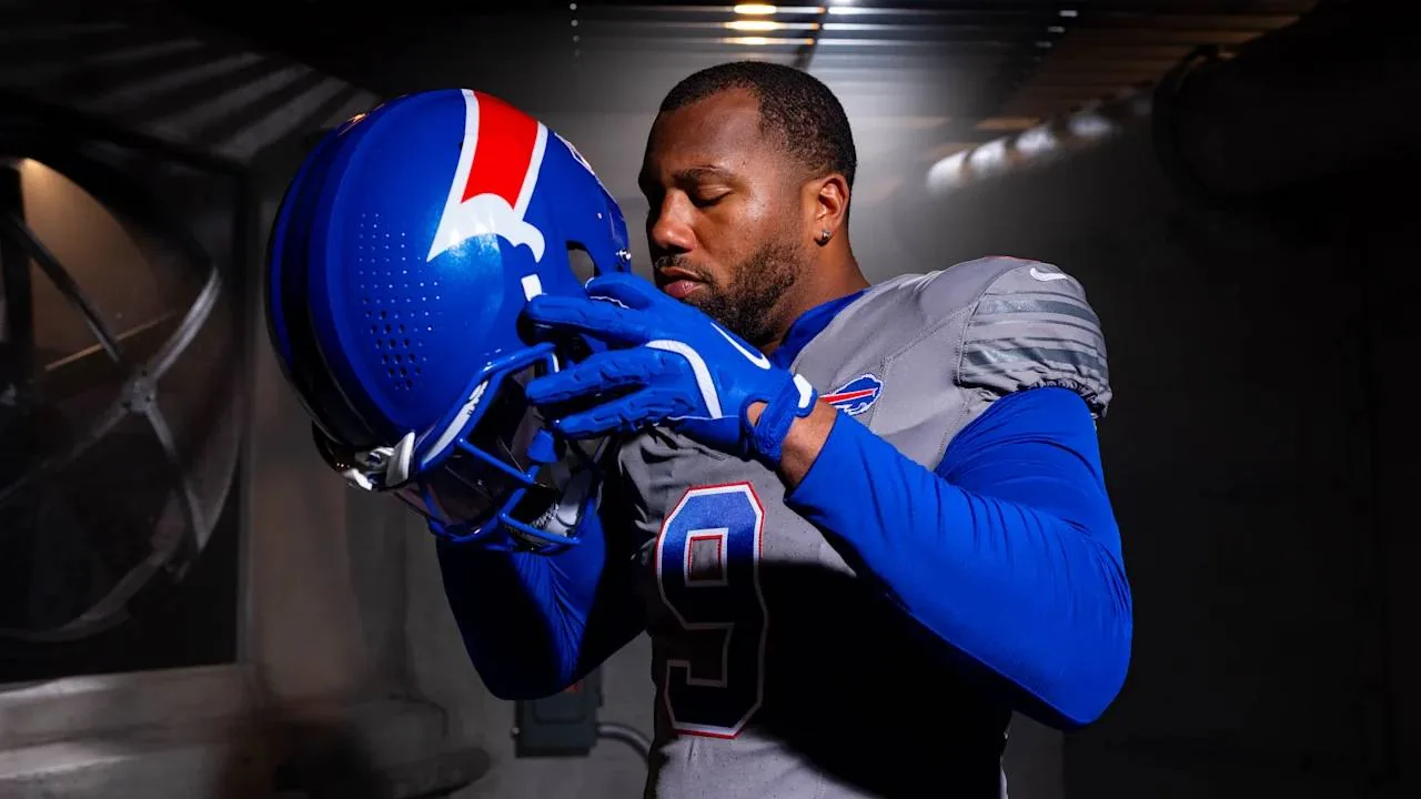
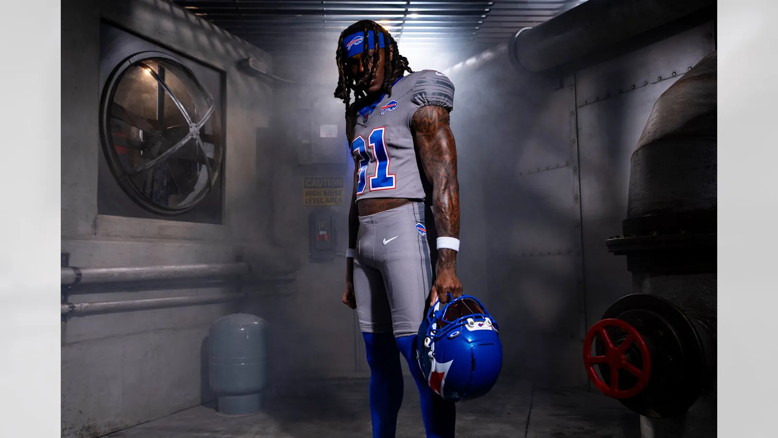
The Buffalo Bills have introduced new ‘Nickel City’ alternate jerseys, which will be part of their uniform rotation for the upcoming season. These all-grey uniforms are designed to pay tribute to Buffalo’s industrial heritage and the city’s blue-collar workforce.
The new uniform set includes an all-grey pant and jersey combination, complemented by a royal blue ‘The Charge’ helmet. This marks the first time in the team’s history that they will wear a blue helmet. The design process for these uniforms spanned eight months.
A Tribute to Buffalo’s Roots
The ‘Nickel City’ moniker and the all-grey colour scheme draw inspiration from Buffalo’s historic steel mills, grain elevators, and rail yards. The design also incorporates a blue collar on the jersey, symbolizing the strength, work ethic, and authenticity of the city’s past and present workers. This aesthetic choice aims to connect the team’s visual identity with Buffalo’s industrial history.
Aaron La Porta, the Bills’ director of design, noted that the grey colour was a brand colour that the team had not previously emphasized. The NFL‘s regulations for alternate uniforms require clubs to use colours already present in their existing palette, making grey a suitable choice for this ‘color rush’ designation.
The visual inspiration extends to the Buffalo Nickel, further reinforcing the ‘Nickel City’ theme. This detailed approach ensures that the uniforms not only look distinct but also carry significant local meaning.
The new uniforms will debut during the 2026 season, which also marks the inaugural season for the newly completed Highmark Stadium. The design team, including La Porta, also contributed to the ‘Cold Front’ Rivalries jerseys that were introduced in 2025.

The ‘Charge’ Helmet and Design Details
A prominent feature of the new alternate kit is ‘The Charge’ helmet. This helmet boasts an all-blue base with a metallic flake finish and additional metallic blue accents. It showcases the iconic red charging streak from the team’s primary logo, including the subtle horn and eye, aiming to bring the logo to life on the players’ headgear.
La Porta described the new helmet as a bold representation of a new era for Buffalo Bills football. The helmet’s design is ambitious yet minimalist, with the red charging streaks originating at the horn along the side of the shell and converging at the rear in a V-shape.
Unlike the team’s standard uniforms, the ‘Nickel City’ jerseys do not feature the ‘BILLS’ or ‘BUFFALO’ wordmark below the collar. Instead, a Bills logo patch is placed on the left chest, intended to symbolize the team’s connection to the fanbase’s hearts. The numbers and player names maintain the same typefont and weight but use a new colour order: blue block numbers outlined in red and white, with white player names on the rear nameplate.
The Bills are permitted by the NFL to wear these alternate uniforms for both home and away games. However, the team has not yet announced the specific games in which the ‘Nickel City’ uniforms will be worn. The previous alternate uniform, the all-white ‘Cold Front’ jerseys, was worn during a Sunday Night Football matchup against the New England Patriots.
La Porta emphasized the team’s commitment to pushing the Buffalo Bills brand while honouring the region’s rich history and legacy. The design process involved careful consideration of fabric colours, helmet paint finishes, and broadcast television tests to ensure the new uniforms met all requirements and represented the team effectively.
Source: sportsnet.ca